
Data Analysis and Visualization Tools for Students
Written by Alexandra Embree
Thumbnail Photo by Lukas Blazek on Unsplash
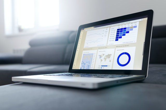
Photo by Lukas Blazek on Unsplash
There is a staggering amount of data in existence in the modern world. To put it into perspective, it’s been estimated that every 2 days we create as much information as we did from the beginning of time until 2003. With the continued rise in adoption rates of smart devices across the world, there’s no sign that this growth in data production will be slowing any time soon.
With this abundance of data comes an abundance of opportunity for discovery and creativity through data analysis and visualization. Whether you’re trying to scrutinize lab results or understand your target demographic through customer surveys, data analysis and visualization can be applied to interpret and subsequently share your data. While many companies are now creating roles for skilled data specialists, you don’t have to be a data scientist to make discoveries from data. Data literacy – defined as the ability to read, work with, analyze, and argue with data, or alternatively, the ability to derive meaningful information from data – is an increasingly important skill to have, regardless of profession. Authors at Harvard Business Review believe that data skills are now essential for almost every role in every organization.
Though many people understand the importance of data literacy, it can be difficult to know where to start in the process of learning the relevant technologies for data analysis. There are dozens of platforms for data analysis out there, and each promises to be more intuitive than the last. This is why I’ve picked out four of the most prominent options for data analysis and visualization to share below. Whether you’re at a beginner, intermediate, or advanced level in your comfort and fluency with technology, one of the options below should align with your needs and skill level. While the tool required often depends on the job at hand, it can also depend on cost, ease of use, and the format of your data.
Excel
Excel is a fantastic tool for data analysis. For starters, it’s already installed on many computers because many enterprises have a Microsoft package license. Excel is highly intuitive and widely known; most people with basic computer literacy already have a general sense of how to move cells and functions, as well as perform formatting tasks.
Another bonus for the use of Excel for data analysis is that many datasets are already in Excel format. It’s common to get data in an Excel spreadsheet, or in a .csv file which Excel allows you to import relatively simply with the import data function.
As a result of this convenience, Excel is a great way to perform basic data analysis tasks for work or school. Downloadable packages like the Data Analysis ToolPak makes Excel robust in terms of the numbers-crunching side of data analysis. Pivot tables and pivot charts, a popular Excel feature, are also a great way to perform an exploratory analysis on your data.
The current iteration of Quantitative Methods II at SMU, MGSC 1206, provides an introduction to the use of Excel in analyzing data - if you’re a SMU student who is interested in this topic, taking this course is a great way to practice these skills while studying. Courses in research methods or computer applications, both of which are available at SMU, can also teach you how to critically analyze data and use Excel, respectively.
Tableau
Tableau is the self-reported market leading platform for business intelligence and analytics. Unlike the next two options for data analysis, PowerBI and Python/R, there is no programming required to become adept with Tableau.
Immediate access to powerful visualization and dashboarding capabilities is the main competitive advantage of Tableau. Dashboards are single screens that display key pieces of business intelligence information - an example of a great public dashboard is the Nova Scotia COVID-19 dashboard, which updates COVID-19 case numbers and vaccination rates daily. While this particular dashboard was created with ArcGIS, a geographical information system, Tableau allows for the creation of similar displays. Tableau can import data and be synchronized with relational and non-relational databases, cloud systems, and file formats (such as Excel or CSV). Tableau’s compatibility with cloud systems and big data technologies like Spark, Hadoop, and NoSQL make it ideal for big data analysis.
Tableau is the most expensive option for data analysis of the four methods I’ve discussed here. Enterprises and individual users are charged approximately $70USD/user/month. However, a year long Tableau subscription is 100% free for students! Taking advantage of this free license can allow you to create top-notch visualizations for your projects and research while learning an in-demand skill that your peers may not have had exposure to.
Photo by Clay Banks on Unsplash
PowerBI
PowerBI is Microsoft’s Tableau equivalent. Given that it’s a Microsoft product, it can be economical for companies who already have Word, Excel, PowerPoint, etc, and want to expand their software lineup by upgrading to a Microsoft package that includes PowerBI. It’s free to install and start learning for all, and the pro version is also relatively affordable for a single individual, at a price point of $12.80CAD/month/user. This relatively low price when compared to getting a separate subscription for data analysis makes PowerBI attractive on the affordability metric.
PowerBI’s compatibility with Microsoft formats like Excel spreadsheets and Azure datasets makes it a good fit for a company that uses this stack. It also supports data in SQL, XML, and JSON formats, and integrates with some popular services like Google Analytics and Facebook. PowerBI supports the creation of interactive visualizations and reports, which are highly flexible.
Unfortunately some PowerBI features, such as the DAX query language, are very challenging to learn, so the platform is not entirely intuitive.
Python and R
Unlike the other options for data analysis listed above, Python and R are not user interfaces, but rather programming languages. This makes them more suited to users who are quite comfortable with technology, as they require some comfort with programming principles and using an IDE (integrated development environment). The relative complexity of learning Python and R is offset by the low cost and high flexibility that using these languages provides.
There are a wide variety of libraries and expansions that can be downloaded and configured to abstract the nitty-gritty of doing data analysis with these languages. Top visualization libraries in Python include matplotlib, plotly, bokeh and seaborne; in R, there’s ggplot and plotly again. For data manipulation/analysis, pandas is the most popular option in Python, and dplyr in R.
The benefit of learning Python and R libraries is that as you develop comfort performing data analysis and visualization in an IDE, you can potentially move into using other libraries for machine learning and engineering. If you’re a highly technical person who likes a challenge, or are potentially interested in pursuing data science as a career path, performing your data analysis and visualization in Python or R could be ideal for you. This is not to say that only the most advanced users can use these libraries - the basics of pandas, for example, can be learned in a few hours - but it makes more sense to use if you either have very little access to other software or are technically advanced. It can also make sense to use these programming languages if you want to create highly custom, technically impressive visualizations that are transparent and reproducible.
Getting Started
There are dozens of platforms and tools for data analysis, but the above four demonstrate the breadth that these tools can span. In most cases, one of the above will be perfect to enhance any given student project, but you can’t go wrong with learning any of them.
If you don’t have an active project that requires data analysis or visualization, I recommend a quick browse of the subreddit r/dataisbeautiful for some data visualization inspiration. Users of this subreddit share their visualizations and critique those of others to help them improve in the field. Seeing the choices that others make in their visualizations (both in what data they use and what formats they choose) can help fuel your creativity for your next project. Another great resource is Kaggle - here you’ll find datasets from all domains that you can use to practice with.